The Clove Club
A Website Re-Design Project
Project Type
Website Design
Timeline
Four Weeks
Hats Worn
Researcher, Design Analyst, Brand Designer, Information Architect, UI Designer, UX Writer
Project Summary
Design Process
Understanding the Restaurant
To start the design process, I immersed myself in understanding The Clove Club's essence. Under Chef-patron Isaac McHale's guidance, the restaurant presents a seasonal tasting menu highlighting skillfully sourced British ingredients. Inspired by the luxurious comfort of a yacht, its warm and inviting ambiance fosters a relaxing and fresh dining experience.
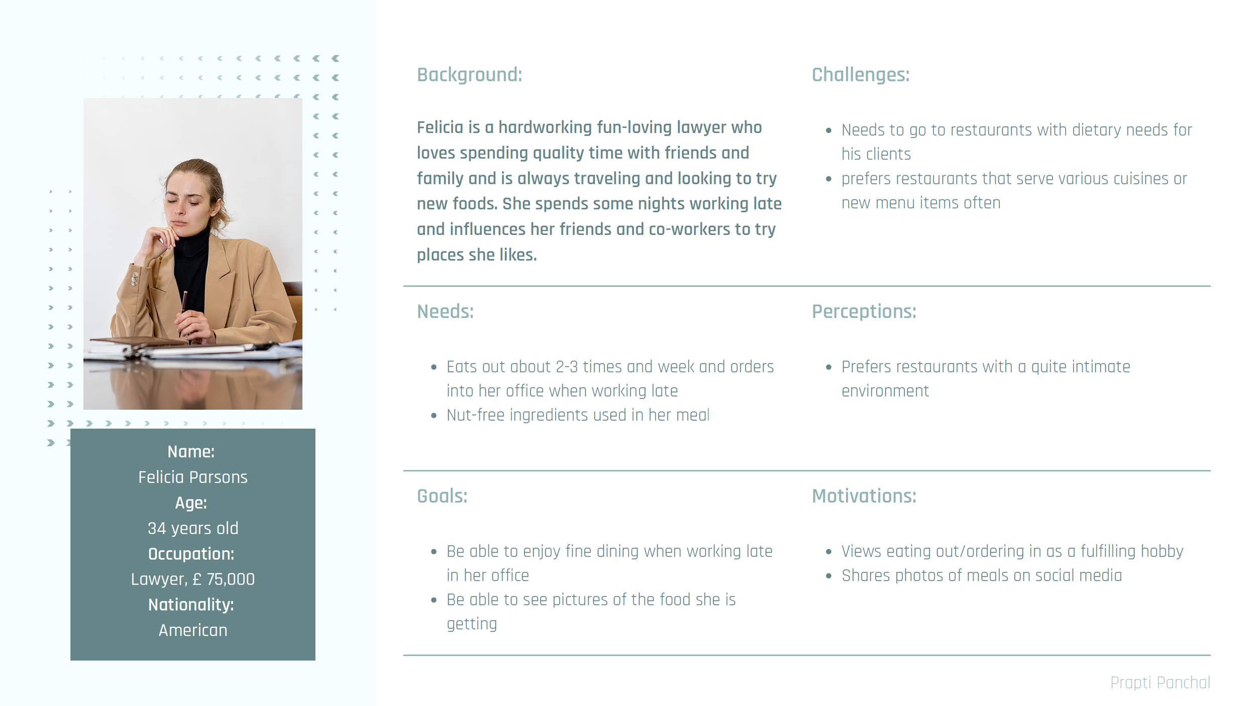
Creating User Personas
SWOT Analysis
WordCloud
wordcloud
Fish-Monger
seafood
sun
fishes
shellfish
filet
hooks
shear knife
scaler knife
filet knife
tweezers
scales
fishbones
shells
Luxury
diamonds
gold
peacock
feathers
marble
yacht
fishing pole
leather
cipher
monogram
scepter
seahorse
jewels
sapphire
crown
Gastronomy
Food
beverages
cocktails
vegetables
fish
shellfish
foam
bubble
bar
chef
Michelin star
wine bottle
glass
cocktail glass
plating
Beach
waves
ocean
sand
sun
umbrella
chairs
flip flops
fishes
turtle
shellfish
pebbles
footprints
tiki-bar
sun-hat
Exploring Elements
The yacht represents luxury. The ambiance of the restaurant is described using this element. It brings about comfort, warmth, soaking in the sun, and freshness. It gives the feeling of a vacation, representing the cuisine served as well.
The sea horse represents loyalty, strength, and serenity. Seahorses also bring about a calming warm feeling. Represents the keep-going attitude of the Chef.
The shell represents the long and complex evolution the restaurant has been through. It also talks about how the restaurant has evolved and will keep evolving.
Inspired by the Chef's start of his journey as a fishmonger, I thought of using fish scales. It represents the roots of the cuisine served and connects the story from the past to the present. This idea is modern, minimal, and elegant.
Logo Ideation
Finalized Logo
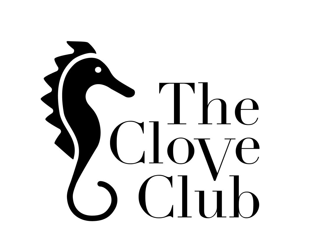
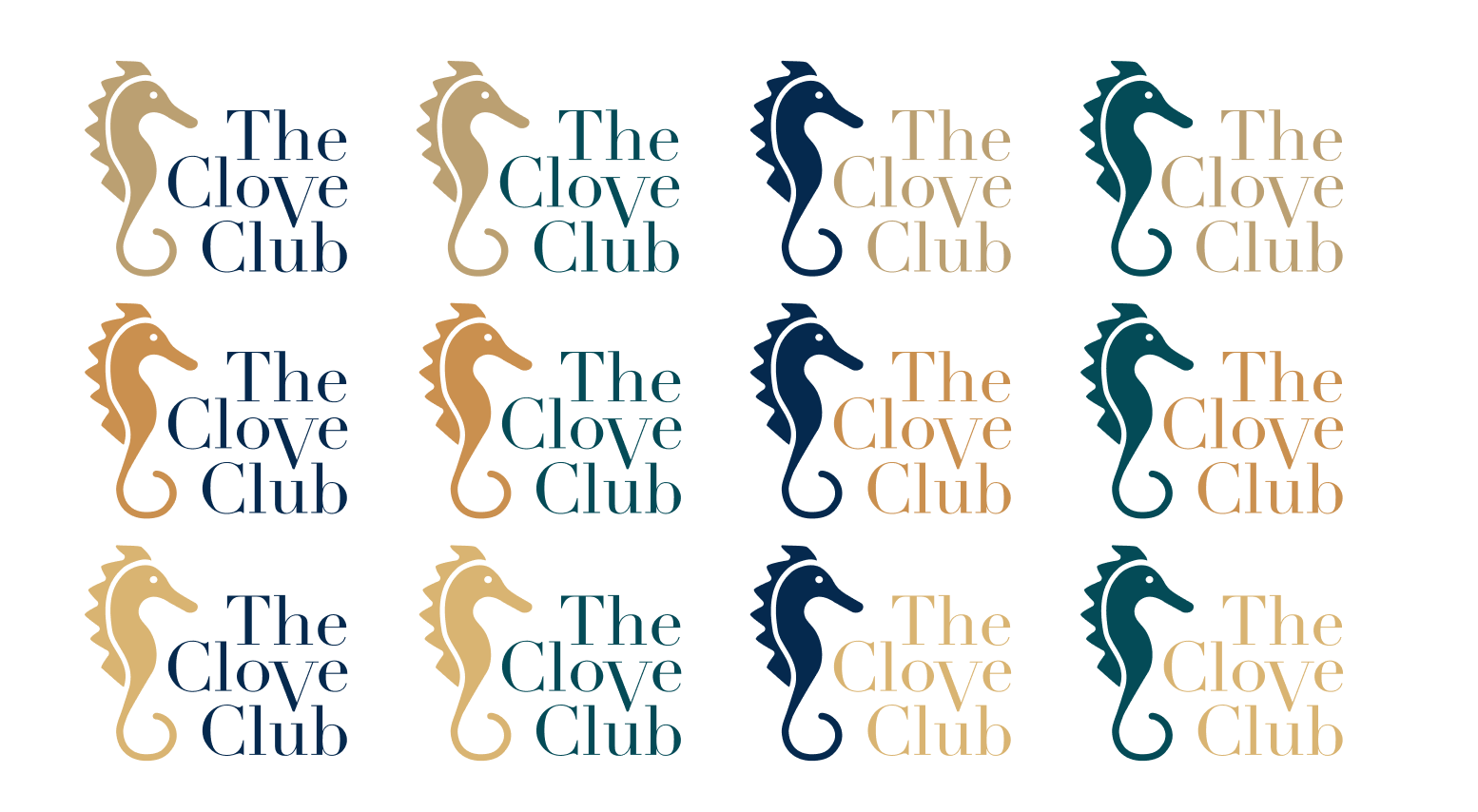
This logo depicts the royal aura of a sea horse as well as its loyalty. The typeface is delicate yet strong, and the serif adds to the luxurious impression. The font positioning is very elegant, classy, and playful. The positioning of the logo mark and logotype gives a nice balance of white space between all components. The bigger "V" draws attention to the most significant word, "clove." The sea horse also reflects the chef's connection to the ocean, as he began his career as a fishmonger.
Exploring Color Schemes
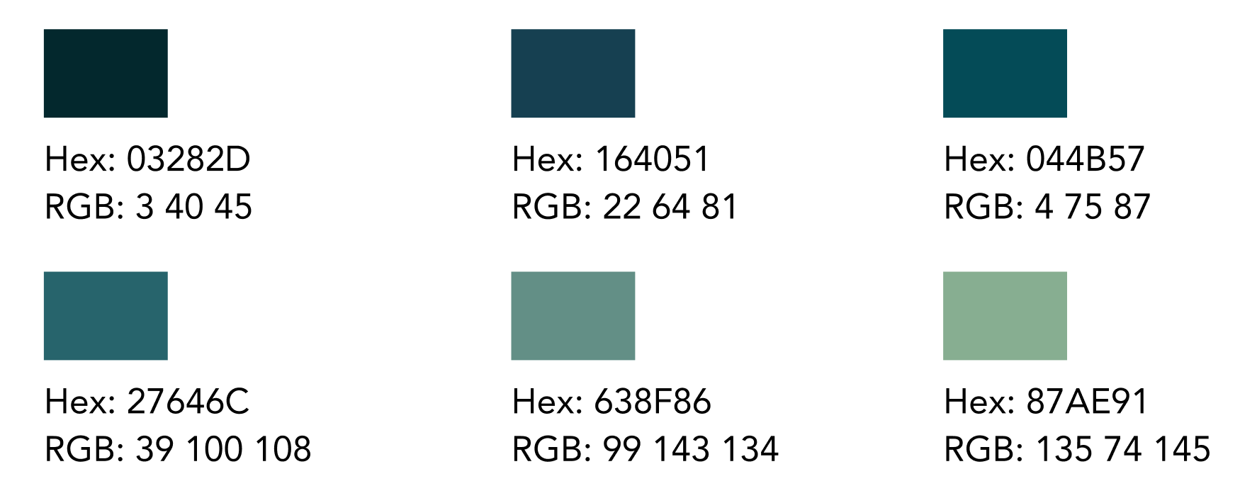
Monochroatic ( Blue-green )
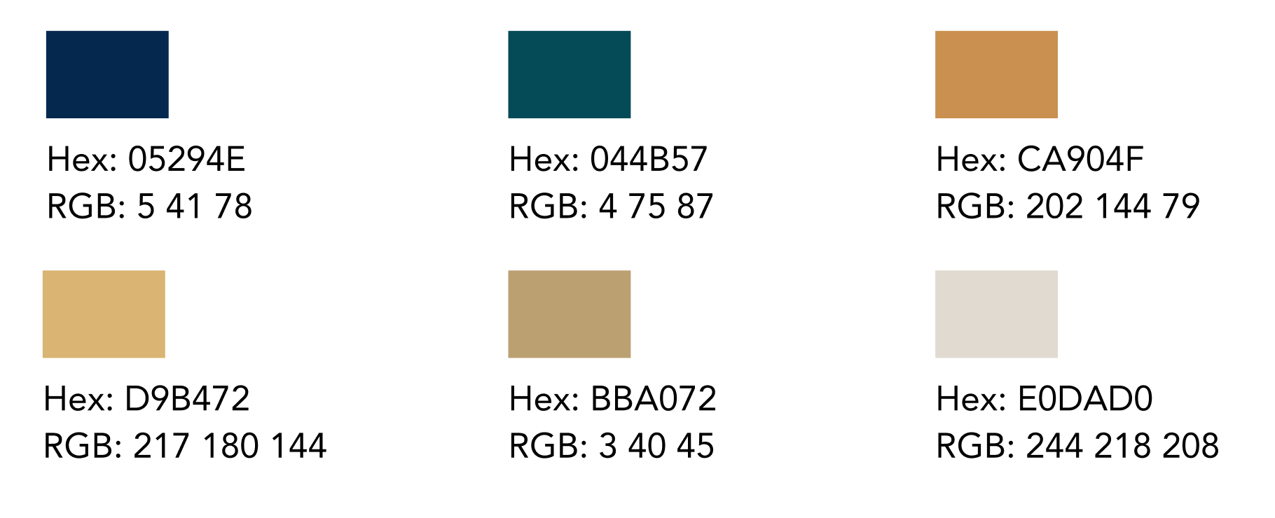
Complementary ( Blue/Yellow Orange )
Triadic ( Blue-green/Yellow Orange/Red-purple )
Analogous (Blue, Blue-Green, Green, Yellow, Yellow-Orange)
Logo Color Exploration
Finalized Color Logo
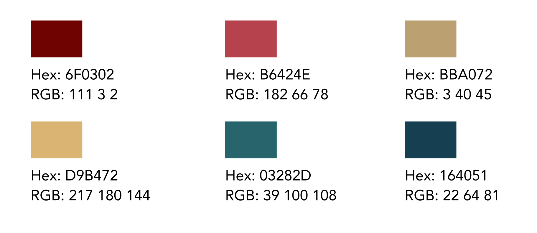
The chosen color palette is a complementary color scheme. The deep ocean blue represents the ocean's roots in the cuisine provided. Blue also represents security, trust, and loyalty. The gold yellow used for the sea horse conveys a sense of royalty - luxury and beauty. It also represents the natural color palette of a sea horse, implying the freshness of the ingredients chosen to enhance the great dining experience. The complementing color palette contributes to the relaxed and pleasant atmosphere.
Business Card
Analyzing the Current Site-Map
Site-Map Redesign
Updated Page Designs
Home Page
Enhanced visual appeal through integrated clickable links for essential pages.
Developed a refined and inviting hybrid grid layout.
Streamlined navigation to improve user experience.
Created an engaging gateway for exploring the restaurant's offerings
About The Clove Club
Transformed it into an immersive hub featuring the restaurant's story, Journal, and Newsletter sections.
Crafted compelling UX copy to evoke anticipation and exclusivity.
Enhanced engagement with impactful imagery in strategic sections.
Menus
Menu Home
Enabled effortless navigation through various menus with simple clicks.
Enhanced visual appeal with enticing images of dishes and drinks to captivate visitors.
Implemented a 2-column grid layout for clear menu presentation and seamless browsing experience.
Menu Detail
Replaced downloadable PDF with a rich, luxurious menu detail page.
Maintained hierarchy and menu item clarity throughout the design.
Included dish descriptions for allergy awareness and flavor visualization.
Implemented breadcrumbs for clear navigation tracking.
Wine & Cocktail Bar
Developed a dedicated Wine & Cocktail Bar Menu page to enhance the drink selection.
Included clickable links for the Wine list and a marquee scroll showcasing handcrafted cocktails.
Utilized enticing images to engage users and highlight cocktail details.
Ensured seamless navigation with breadcrumbs and essential reservation section in the footer.
Contact Us
Provided options to message or email the restaurant for user convenience.
Included essential contact details such as address, dining times, locations, and phone number.
Streamlined communication with a "Contact" button for easy dialing.
Learnings
Through this project, I learned valuable insights into analysis, design thinking, and the design process. Conducting a SWOT analysis highlighted key aspects. Crafting user personas deepened my understanding of the target audience. Designing the logo and selecting color palettes taught me visual storytelling. Redesigning site maps and layouts emphasized intuitive navigation and content clarity. I also learned the impact of imagery and hierarchy in design. This project enriched my understanding of user-centric design and its role in creating engaging experiences.


