Cleanse
Embark on a Sensory Journey
Project Type
Packakging Design
Timeline
Four Weeks
Hats Worn
Researcher, Brand Designer, Communication Designer, Packaging Designer
Project Summary
Creating Cleanse Cosmetics
Inspired to empower young women aged 15-30, I conceived Cleanse as a startup that offers high-quality skincare products at affordable prices. The brand seeks to enhance the skincare journey and foster a culture of self-care among its audience
Analyzing the Products
Material Selection
Typography
Color Palette
Crafting the Cleanse Logo
Label Design
Cleanse Body Lotion Tube
Cleanse Body Scrub Tub
Secondary Packaging
Prototype 1
Prototype 1 initially caught my eye but fell short of meeting the requirements. The design lacked sufficient space and seemed fragile, raising concerns about the fit and grip of the heavier products
Prototype 2
Prototype 2 showed promise with good product accommodation and grip but lacked the feminine touch essential for the Cleanse brand due to sharp edges. Stackability concerns also arose, potentially impacting its shelf stackability.
Prototype 3
Prototype 3 met all requirements. Made from sturdy corrugated board, it featured a curved top for easy access and partitioned compartments to protect products. Its flexible design accommodates various sizes in the cosmetics industry.
Multipack Die Cut Design
Die Cut Design for Cleanse Multi- pack
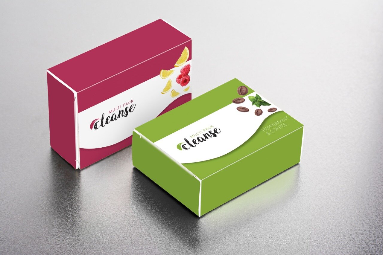
Cleanse Multi - pack
Learnings
Designing Cleanse's branding and packaging was a valuable learning experience in creating visually appealing and functional designs. Key takeaways from this project include understanding the target audience, ideating creative concepts aligned with the brand's vision, selecting appropriate materials, conducting market analysis for effective positioning, recognizing the packaging's impact on brand perception, and fostering creativity to innovate in a competitive market.


